Exhibitions
Documentation
Essays
Reviews
Lines and cracks and zebras and horses
West Hollywood, California
Michael Genovese’s second solo exhibition with the gallery, titled Lines and Cracks and Zebras and Horses – a recently completed body of work based on lineation, cleave, and the concept implied by the aphorism: “When you hear hoof beats behind you, don’t expect to see a zebra.” A series of plasma-cut steel wall reliefs located throughout the gallery compose a subtle arrangement based equally on materiality and concept.
These raised, sculptural “drawings” suggest following the maxim that common sense is the shortest distance between two points or to recognize the grace in directness. Genovese recreates various, common occurrences of line – an architectural fracture; a hair in the bathtub; the mark of automatic writing; a military line of demarcation; a varicose vein, or a simple fabric seam…
-
-
...But not simpler...
Catalog Essay by Shamim M. MominThe title of Michael Genovese’s exhibition (Lines and Cracks and Zebras and Horses) draws in part on a colloquial aphorism — “when you hear hooves beat behind you, don’t expect to see a zebra” or “when you hear hooves beat, think horses, not zebras” — which typically is understood to evolve from the principle of Occam’s (or Ockham’s) razor. Attributed to the 14th century logician and Franciscan friar William of Ockham, the principle states, “Pluralitas non est ponenda sine necessitate,” or “Entities should not be multiplied unnecessarily.”
Over time, this principle has been largely misunderstood to mean that as a general rule, in both science and philosophy, one should stick with the most “obvious” hypothesis or conclusion, as that is typically the correct one. In fact, what Occam proposed was a guideline to developing a theory, not a conclusion: the idea that when you have competing theories that make the same predictions/conclusion, the simpler is better. Importantly, the notion of simpler is not necessarily what seems most obvious (which usually includes one’s untested biases, preferences and predilections), but rather the one with the most observable elements (empirically testable), the fewest new assumptions. It is a means to keep one’s focus rigorous, to start with the things we can observe, and not yet add to it the seduction of complex settings to achieve the same goal. It is, merely, a way to begin, a rule of thumb—not a scientific axiom as it is often employed. Also critically, while intended to separate two theories that make the same predictions, it in no way precludes that another theory might make a different prediction altogether about the same phenomena. It does not deny the complexity of organisms, it just suggests a complex thing does not obviate the expectation of empirical simplicity. It does not promise that our notion of ‘simple’ (a subjective term if there ever was one) might not be quite different from that of, say, quantum particles, why the sky is blue, the light of stars, or the reason/function of a cat’s purr.The zebra/horse aphorism is interestingly vague in its setup, particularly in the first phrasing cited above. That is, one might could read it as a metaphorical interpretation of the Occam’s razor, wherein the horse is the more observable, simpler theory and the zebra the more unprovable, speculative, with the hooves beats are the conclusive result (the same in both “theories”) — in which case it’s reasonably true to the original principle.
It could also be understood in as the more common misreading of Occam, suggesting that more often than not, the most common conclusion is going to be correct more times than incorrect. The phenomenon is hooves beat overheard, the conclusion should be horses that cause it — it’s a law of averages idea. However, one should note that assumes the listener lives where horse geographically outnumber zebras, a fact true for a large portion of the world’s population, but not all. While it’s still overall the greatest probability, it is still based on assumptive conditions; there is a simple contextual set where this would not be a good idea (i.e. certain plains and mountains of Africa). In this way, it’s actually used most often in medical disciplines, for diagnosis — and in turn coined the term “zebra,” for those uncommon diagnosis that require exactly the kind of contextual thinking, attention to possible unique, unusual circumstances, that the probability approach smoothes out (fans of the excellent, if hyperbolic, show, House, are familiar with this scenario…). What I like about this misinterpretation is that it embraces the idea of embracing what’s not there, meaning those moments are real, if less familiar, and they do exist, quite often in exactly the spaces where we assume the familiar should be. It says “think horses,” or “don’t expect a zebra,” — not that they don’t exist, that they might not be what you see when you do turn around and look.
I saw this on a sign recently, “science is the poetry of reality,” a thought with which I wholeheartedly agree. Genovese’s exhibition similarly takes this poetry of reality — the quiet, overlooked bits and pieces of things we see and alchemizes them (to silver, in this case, not gold, but the metaphorical notion retains). Drawn from disparate, often familiar or banal moments of lines and cracks, the delicate, quiet sculptural interventions reconsider and combine occurrences as varied as a crack in the artist’s kitchen floor, a damaged mihrab from 12th century Iran, a varicose vein (a sub-epidural “crack,” if you will), a line from a captcha (those computer tests that determine a human is using the site, not a machine), and the seam line of an Ancient Greek horse head sculpture, and the stress fracture from a brick building in Compton.
Cracks are typically perceived as the break between two parts, or rather the imminent breaking into parts of what was once whole. Lines, on the other hand, stand stalwart in better graces, that which connects two points, and is often the shorter way between disparate things. While it’s been knocked about quite a bit philosophically and ideologically, linear thinking is a point of pride for many, in that it implies a clear succession of points of cause and effect culminating in a empirically supported and useful conclusion. “Cracked” as an adjective, however, is a synonym for crazy, or at least not quite right, crooked, off-kilter. Lines, good, cracks, bad.
Lines and Cracks and Zebras and Horses”: in that grammatical setup, it seems to parallel lines with zebras, cracks with horses. Following the logic above, this would suggest that ‘lines’ are the less empirically likely to be the right theory, while ‘cracks’ the better assumption in similar situations, cracks. This seems a reversible of expectation, combining the common connotations of all these, one would expect to find the zebras in the cracks, and let the horses follow the lines. However, the parallel is not strictly correct; rather than a comma between the couplets, Genovese connects them with the same conjunction, “and,” making them technically a list of equivalent things. Perhaps lines aren’t the best or shortest ways between objects or places, perhaps they separate rather than connect parts. Perhaps cracks show richness formerly hidden, reveal depth where there was only surface, or function as a suture point that holds things together with true delicacy and vulnerability. Perhaps probabilities change, other options are equally likely, or the unlikely just isn’t unlikely that time—it will be easier to see zebras today, or another uncommon ungulate: a camel, a deer, an elk, a donkey, a gazelle. Perhaps, even once, those hoof beats are a unicorn instead.Shamim M. Momin is an American art director and curator of contemporary art. Momin is head of the Los Angeles Nomadic Division, a non-profit art organization in Los Angeles, California. She is also an Adjunct Curator for the Whitney Museum of American Art where she co-curated the 2008 and 2004 Whitney Biennial exhibitions.
-
Spotting cracks in the system
Los Angeles Times, Sharon Mizota | pg. D18-19 | January 25, 2013Walking into Michael Genovese’s exhibition a viewer might think there’s been a horrible earthquake, or that the space is simply in a state of disrepair. Snaking over the surface of every wall are large, meandering cracks, with unsettling implications for the building’s structural integrity.
But this unease dissipates quickly. The fissures are in fact shiny and metallic, as if filled not with putty but quicksilver. And closer inspection reveals that they are not cracks at all but cut metal objects, affixed to the walls.
This realization feels like a bit of bait-and-switch. Genovese’s installation comes on like a site-specific piece — an engagement with the space of the gallery itself. But the fact that the “cracks” are actually individual sculptural pieces that can be removed and possibly reapplied to different walls feels cynical. They are then just objects to be bought and sold.
Not that there’s anything wrong with that. But additional context is provided by a photocopied book depicting fissures and lines of all kinds: cracks in the sidewalk, maps, zebra stripes, a pendant split into two halves.
Genovese is interested in how lines divide and connect; create distance or communication. His sculptures turn these vectors into objects in their own right, emphasizing the spaces in between rather than on either side. In our increasingly Balkanized political climate, it’s a more than welcome metaphor.
“Shards of Hope.”
The Cornell Sun, Daveen Koh, January 31, 2013Visitors to artist Michael Genovese’s solo show Lines and Cracks and Zebras and Horses in Los Angeles have cause for concern — massive, silvery cracks run along the otherwise pristine gallery walls. The room appears to be on the verge of crumbling. These fault lines are not really chasms (although you can never really be sure about these things in contemporary art). They are more like casts of chasms, memorials to anything that might take on the form of a line, however sacred or banal. Accompanied by a book of line-dominated images, notably a thunderous herd of zebras, the impossibly reflective sculptures are arresting for their scale and symbolism. Each sculpture is the convergence of disparate worlds: Pompeii frescoes meet Metallica; a crack from an Iranian Mihrab dated 720 A.D. fuses with a mortar line from the vicinity of Castillo de San Marcos in Florida. Looking at them, it’s entirely appropriate to feel like you’re in the throes of an earthquake.
In an interview with Genovese explained that his work is about “designating value” to fragments of life. Whether it’s staring at stray hairs in the bathtub or gazing at a historical landmark (a very loaded term, in the context of this show), these moments mean something because, in that instant, we are registering the things around us and trying to make sense of them. By turning a crack, usually associated with damage, into a sculpture, Genovese alters the meaning of the crack.
I like Genovese’s work. It can be simultaneously gentle and violent as it interrupts the everyday and forces you to look at everything twice. The art I am most drawn to often doesn’t conventionally look like art. It’s the kind of art that can be mistaken as debris and accidentally get cleared away by a zealous museum cleaner, as happened to Gustav Metzger’s installation at the Tate Britain in 2004. Incidentally, Metzger’s work was conceived as a comment on the finite nature of art.
Another urban intervention is The Shard, presently the tallest building in Western Europe and London’s highly metaphorical monument to the new kind of financial world, among other things. The Renzo Piano-designed building, with a top like a shattered beer bottle (as The Guardian’s architecture critic Oliver Wainwright has rightly pointed out), is a baffling and unmistakable sight in London’s South Bank.
Among the most prescient critics, I think, is Prof. Hal Foster, art, of Princeton University. In an interview with The Guardian, Foster prefaced his critique of the building by admitting his ambivalence about perceiving the building as image. It is too tempting for many critics to condemn The Shard as no more than spectacle. Foster does not succumb. He reminds us that architecture can bring order to urban life, and “too often in cities people are lost” as they don’t have “symbols to guide them.” The Shard, a striking pyramidal assemblage of splintered triangles, could certainly come in useful as a landmark. That’s at least one point its detractors can agree on. Foster’s allusion to orientation is also unsurprising, since it’s a well-established tenet of urban theory. The landmark is one of the five elements of the city’s new image proposed by the urban planner Kevin Lynch; the stronger and more prominent these elements are and the more harmoniously they are stitched together, the more legible a cityscape is.
I found most of Foster’s commentary almost disappointingly uncontroversial, until he seemed to light up, near the end, when he likened The Shard to “radical surgery” where “they stick a needle into your heart to get it to go again.”
The violence Foster employs is, I believe, justified. His view is that, juxtaposed with other iconic buildings like the Borough Market, The Shard disrupts the neighborhood. There is no attempt at mediation, to bridge the gap in scale between the pedestrian strolling along the Thames and the gargantuan building. I am inclined to agree with Foster’s assessment, though I will add that if The Shard is indeed a monument to a glittering financial world, then the violent disruption is fitting.
Meaning making is a highly tenuous exercise, as should by now be obvious. The more theory I try to read, the more apparent it seems that interpretation is the unification of seemingly unrelated elements, like how Genovese merges ancient Italian frescoes with American heavy metal. Nevertheless, the whole exercise makes perfect sense to me, because I have never been able to forget the words of the first theorist I encountered at Cornell. In The Image of the City, Kevin Lynch wrote, “Nothing is experienced by itself, but always in relation to its surroundings, the sequences of events leading up to it, the memory of past experiences.” I know it can all go very wrong — you can end up very lost or injured as you invest more of yourself into everything that you read and write. There’s also a fine line between creative interpretation and well, delusion, and who should be the judge of where that boundary lies? When so many others seem to have said something cleverer, why should I expect to arrive at something newer and better? I defer to the wisdom of those who have sought and found. Former Prof. Colin Rowe, architecture, wrote in The Cornell Journal of Architecture with characteristic adventurousness, “Therefore to agitate and to animate a very few ideas we will begin with a set piece which is going to be partly history and partly parable.” Or more simply put by Renzo Piano, designer of The Shard, “The best things in life are always a little dangerous.”
-
Natalie Hegert
InterviewLos Angeles, Jan 13, 2013: As I drove up the 5 freeway to meet Michael Genovese, my car radio was tuned to 88.9 FM. Between Anaheim and Norwalk, the radio transmission began to flicker back and forth between the two college radio stations that share the frequency in Southern California. For a few miles the radio was caught between KUCI and KXLU, between mellow beats and experimental noise. I let it play through, enjoyed the give and take, the struggle.
Michael Genovese, whose solo exhibition Lines and Cracks and Zebras and Horses is currently on view in West Hollywood, makes work out of fragments and fractures: fragments of histories and conversations overheard; fractures found in all manner of places, from walls of antiquity, to a crack found in the floor boards of a house in Los Angeles. These lines, derived from a combination research and serendipity, appear as faults in the architecture of the gallery, yet reveal themselves as something between sculpture and installation, zig zags of mirrored metal bolting across the walls. Some of the works cause gaps in perception when viewed from particular angles; some are reflective and come alive as you walk past. While he installed these works in the gallery space, we talked about these fragments and fractures, and bout gestures, value, fear, and Metallica.NH: How did you go from text-based works to line and drawing? What’s your relationship with drawing essentially?
MG: What interests me is how the written word is direct and communicates through a filter of handwriting analysis and cross cultural comparisons. The space between words, the direction of how they are written, how paragraphs and columns are divided, the space and tension between things – these aspects are what pulled me in closer to working with just the line, void of text.
Focusing on how, where, and why cracks and lines appear was a cathartic solution to help dissolve a lot of the clutter. To express a direct statement about what I have learned, and pose new questions about the work I am making.
NH: How does this work relate back to your interests in society and history?
MG: I recently completed a project (P.S./P.P.S, 2008-2012), wherein the public was asked to write and draw on surfaces I designed. They were placed in social spaces in different regions of the country, and given specific themes. As the final part of the project, I researched, transcribed, and produced subjective works born out of the unedited information and compositions I discovered. Lines were extracted from images I found through that research, or which correlated with the text and interests from the project.
The work represents a sort of symbolic meaning to me. From what I’ve recorded, the sentiment is that of disrepair, signaled by a change – some willing to go with it, some not. It’s also worth looking at what is not there. What people are not talking about, or what is removed, scratched out, or redacted from the dialogue.
NH: I’m curious as to how you’re translating those lines that you find; how do you reconstruct them?
MG: An example is in Augustine Mihrab, where a traced segment from a found image of a fractured Mihrab in Iran from 720 A.D. is coupled with a mortar line I was studying at Castillo de San Marcos in St. Augustine, Florida. The work evolves by tracing and drawing with these lines. By placing them together I am creating a time line and a combined history of place that wouldn’t ordinarily exist. What made it work from me is how it looked aesthetically, what I learned from both of them and the questions they pose as a combination. What does it mean to have the damaged line extracted from the image an old Mihrab, fabricated and situated with a line copied from a monument of early American history?
NH: So where do you make the connection between Pompeii and Metallica, for instance?
MG: Sifting through images of fractured antiquities, I arrived at the Pompeii frescoes. What I was drawn to were not the paintings or the decorative elements, but the cracks in the wall. They felt as if they were the most prominent part in the visual narrative, and the most natural and visually compelling line that summed up the story. I extracted those moments and coupled them with lines or fractures from my environment to create this sort of time line of particular situations.
NH: Well you see passage of time, disintegration…
MG: Passage of time, disintegration… Or how about something happened bigger than the work itself and how painting or the environment is shaped by what is going on outside of the work at hand. The work is a byproduct as a signifier of a story.
NH: So what about Metallica?
MG: ...And Justice for All, for one, is a brilliant album. It’s a record I grew up with, but never imagined that it would make its way into my work. Everything about that album cover was highlighted because of the research I was doing. It embodied what was going on at the time. Lady Justice blinded and tipping, her breasts exposed and money flying around everywhere, the walls behind her cracking. So, I paired it up with what I was working with from the Pompeii frescoes. For me, it becomes this quieted relic of time.
NH: For a future archaeology…
MG: It’s not archaeology, but in my mind, if someone were to trace this and find it’s sources, using a Google image search, or whatever they have in the future, is funny to me. People in smocks sitting around listening to ...And Justice for All trying to make sense of it, is a great fantasy. Just recently, I was looking at the Stravinsky drawing by Picasso. This was a drawing I had to recreate, upside down, over and over again as a kid learning how to draw. It had me revisit and investigate who this person was, and there I was, listening to Igor Stravinsky, piecing together a timeline learning about the artist and his interests.
NH: Well but in a way, it’s not really important when you view them, where these different fragments were sourced from. That’s what you, the artist, get out of it.
MG: Right, the idea that this information has the possibility of being something else. The installation of the work in the space as a whole transformed into a room of quiet passages or moments that escaped their original meaning.
NH: What I thought of when I first saw these works was Richard Serra, splashing lead.
MG: Right, the nature of the material. The slag, the thickness, it’s materiality being presented as something that “is” but other. How to compose this material with integrity was something I looked to Serra for. Seeing Serra’s Band (2006) at LACMA, and the beauty in where the seams of the slabs join and meet, stuck with me.There is a piece I made in the show titled Seam of Band, where one of the pieces is installed perpendicular with the unpolished slag faces the viewer and it floats above the floor. It starts from the bottom wide, and makes its way up to a point.
NH: So it’s like a kind of suture, that fits flush.
MG: Right. The front view as a 3/16” line is a positive relief inspired by a modern work of art from where the weight and tension rely on one another to exist. From the side is a slag profile that reveals the cuts.
NH: Were some of these pieces made with the gallery space in consideration?
MG: Combination #6 is site-specific and activates the architecture. It starts at the top on the face of the wall, and makes its way around, over and down a window sill, to continue on the face of the wall to the floor.
NH: They’re so reflective.
MG: Most of the work made, except for three pieces, were finished with a nickel plated mirror polish on the face of them. The space has large windows framed in ivy and facing traffic, some with direct sunlight. I like how the work is activated by movement and shimmers when alone. Some appear as if the wall is scored and you are looking outside through the wall. With the audience in mind, I wanted you to catch a distorted sliver of a reflection of yourself.
NH: In your artist statement you say that your work is an “investigation of worth.” What does that mean exactly?
MG: How do we transform an object into something of value? Not monetarily, but of true personal value and worth that can be shared as an expression of existence. The root of this work was born out of making an assumed negative into an exaggerated positive relief. Looking at fractures in the built environment, a hair found in the bathtub, or broken relics, I am searching for a better way to deal with this. By making an object that suggests contemplation, the definition is reassigned, and makes way for something I can’t fully understand, rather than it being very straight, or stopping at the fear or negativity of the outcome.
NH: Your negative value…
MG: The negative value possesses a strong sense of energy to manage. So, I look to scenarios that evoke fear, isolation, or anxiety to process them in a way to where I can better understand them, and use them to an advantage, rather than a deficit. The crack and hair pieces in the exhibition are a good representation of that.
NH: Make it into art…
MG: There is a process that considers the art canon, and uses an expression to document a time and place. It is shown under the umbrella of fine art and its history of display, but my work doesn’t fit neatly into a category like painting or sculpture or other work I do that may be blurring the lines of social practice or teaching. I am dealing with my own situations with objects and what’s going on around me. When you’re looking at a crack, what we typically see as damage, I’m making that negative into a positive. So, this is a recurring theme in my work. A hair I found in the bathroom: what does a hair mean when you find it in the bathtub? That’s what I do, what I’m thinking about [laughs]. Designating value to that sort of stuff.
NH: It’s funny you say that, because for me personally, I’m always staring at hairs I find in the bathtub.
MG: Are you really? Or are you being sarcastic?
NH: No, really!
NH: What do you think you’ll do next? Continue making these?
MG: I am working on making more subjective work born out of the information I gathered over the passed four years through my archive. Yes, I’m into the constraints this process has had for me. I have a few more ideas about his work I am fleshing out.
NH: In the show title, what do you mean by zebras and horses?
MG: It refers to a time when I used to go to the hospital a lot, because I would get these chest pains, and I kept thinking I was having a stroke. So I’d zip over to the emergency room over and over again. And eventually they just told me, “You’re a healthy man and you’re thinking zebras instead of horses.” And just the use of that language made me realize that it was all in my head. I was freaking myself out, my diet was way off, too much coffee, not hydrated, very basic things were jolting me. I was able to put it in perspective and see it as it was, at its most basic form, and work with it from the bottom up rather than top down.
-
Joilet
Paris London Hong Kong
Chicago, Illinois
“Genovese’s cracks are nickel plated steel. They crawl the wall like rivulets of ore to be mined, river ways carving up the drywall and heartache, cast and preserved bijoux that gives the room character. They are copies, these cracks, that remember a history that marks another matter, but here cut from their origins, they are meditations. Pauses that are divorced from spectacle and dazzle, yet manage to pay respect or honor in their heft and their might and subtle shine the great events, the affairs, the phenomena whose full weight is brought to bear and registered, as fracture. A life lived is inscribed by the cracks and the fissures; the big events are permanently worn and remembered”
-
-
Joliet
Essay by Shannon R. Stratton
In university my friend, a former ballerina, discovered she had caused a stress fracture in her shin from working out too much at the gym. Sometimes described as a hairline fracture, I imagined watching this crack creeping across my friend’s leg like a sheet of ice crazing under my foot as my full weight came to rest on its cool surface. Or, to put the emphasis on the “stress,” I imagined my entire body slowly shattering when the weight of anxiety or fear or loneliness could be felt too heavily on my mind, my shoulders, my heart.While I’ve seen cracks and crazes, and fractures and fissures, the imagining of the incident, the slow traveling of the fractures path as it tears, at a meandering pace, throughout he matter that it is dividing, has resonance. It’s a sharp pang in the stomach you let slip between your fingers the moment , the person, the place, and it falls away from your grasp for good. It’s an ache as a distance stretched out between you and a loved one when the last words exchanged drive you further apart and you both watch, dumbfounded, as this last breach gapes wider, it’s a twinge in your heart as you taste the bittersweet. It’s the distress that crumples the mind, fragmenting into a million little cavities that hold a million little details that can no longer be held together. It’s the sting of disappointment that splinters the ego, as bad news comes to rest. And it is also the stitch, that creeps down your side, marking a moment of exertion when your body feels the last burst of its efforts in a sensation that both severs and joins it, a sensation of both pain and triumph.
Is this what it means to suffer fracture? Is it only pain? An emotional rending that leers its way through nerves and blood and bone and flesh and heart and brain like a surge of electricity cuts through the sky? And why then, is it only sometimes beautiful? Lightening surely fills us with awe, but the soft crazes of a porcelain tea cup or the fissure that worms its way through marble, have a sense of history that soothes us, while the crack that bursts through plexiglass is an eye sore. The plexiglass is ruined, it’s purpose marred and impaired by the crack, but the marble has acquired more character. The fissure is at home with the gently worn depressions where a million feet have been given support as the beat a path to and fro.
I work my way through this emotional inventory of pangs and twinge, stitches and stings, and wonder which mar the person and which lends him character? What aches make us beautiful, while others weaken our core?
Michael Genovese titles his exhibition “Joilet” The not so little town that butts up against Chicago, who’s weight perhaps tore it from Cook County early on, to become the seat of Will County to the SouthWest. Its great prison looming large throughout it’s life, until it closed in the early 2000's as its buildings aged into hazardousness. Joliet’s prison weaves itself into art into American Poetry and Music and film, a great looming icon of the great fractures that weaken us all, in the most complicated off ways, systematically, socially, politically.
And then there is the Des Plaines river, that cuts Joliet in two. The River that brought its namesake, French Canadian explorer Louis Joliet, to camp on a mound no in the South West of the city in 1673. A mound that was later mined until it became a depression. It’s excavation, through perhaps a thousand stabs of a pick ax or blasts of dynamite, leaving a hollowed out summit, deflated onto itself.
Or perhaps Joliet conjures something else, as the nucleus of fracture; a city that has lived its life as a transportation hub with riverways and railways and highways meeting meeting and radiating from here. An allusion to the heart from which a fracture emerges. The site of impact as well as the site of termination, as just as many ways come to an end here, as they are gotten underway.
Is the nucleus of the pang, the twinge, the ache, the heart? Does Joliet shimmer and become once again Juliet? Now, Shakespeare’s heroine for whom the intensity of young love shatters her very core, yet in the end reconciles two families fractured from years of feuding. A dagger plunged into a heart; is at once a violent stitch that repairs a rift.
For an artist who has spent much time with writing and the meaning wrought by inscription, whether invited or in the case of graffiti, renounced, Genovese’s cracks are also another script. But unlike a script that fills in the gaps, it instead marks an event or the event makes the mark and the particulars of the story are vacated. The marks that are left, the cracks the fissures are a record whose language we are fluent with only effectively, allowing legibility only through filling the lacuna on either side of these fractures on their left or right, before or after) with our own collisions.
Genovese’s cracks are nickel plated steel. They crawl the wall like rivulets of ore to be mined, river ways carving up the drywall and heartache, cast and preserved bijoux that gives the room character. They are copies, these cracks, that remember a history that marks another matter, but here cut from their origins, they are meditations. Pauses that are divorced from spectacle and dazzle, yet manage to pay respect or honor in their heft and their might and subtle shine) the great events, the affairs, the phenomena whose full weight is brought to bear and registered, as fracture. A life lived is inscribed by the cracks and the fissures; the big events are permanently worn and remembered. - Shannon R. Stratton
-
Joliet
Exhibition review by Monica Westin for Newcity, Chicago
Michael Genovese’s linear wall reliefs mimic the everyday cracks in pavement, walls and other human structures that surround us; they also serve as traces and indexes of the less tangible fractures around us. His current exhibition at Paris, London, Hong Kong (the new gallery’s second show), “Joliet,” references the city that brands itself the “crossroads of Mid-America” and has historically served as both a railway transportation hub and a site for adult and juvenile prisons. Genovese, originally from Chicago, uses these local associations to his advantage, giving the slick, nickel-plated, mirror-polished steel cracks that crawl across the gallery space more political and historical weight. But the formalisms of the cracks themselves stand alone as repositories for abstract imagery from natural and invented worlds: like stitched seams, imagined lines of constellations, and uncanny growth of strange plant life, they seem filled with forces of gravity and grace, dripping down walls or attempting to scale and branch. The overall effect recalls Charles Ray’s famous declaration about “Hinoki,” on view at the Art Institute of Chicago, that he was trying to “breathe intentionality into” the found rotting log that he copied in a wooden sculpture. Nickel-plated pipes and occasional sculpture offer counterpoints, as do some apples of different colors cut in half and rubber-banded together — a suggestion that we ought to take the show somewhat playfully — and the artist book “Lines and Cracks and Zebras and Horses,” which combines Genovese’s photographs of found cracks with shapes that echo them.Author Bio
Monica Westin is an arts writer and historian of rhetoric based in Oakland. A regular contributor to Artforum.com (reviews) and BOMB (interviews), Monica’s criticism, essays, and interviews related to art and aesthetics have also recently appeared in PBS’s Art21, Art Forum, ,The Believer, The Brooklyn Rail, Raw Vision, VICE technology blog Motherboard, and 3 Quarks Daily. Since moving to the Bay Area in 2013, her writing has appeared locally in SFAQ and Daily Serving -
Intervals
Moran Bondaroff
West Hollywood, California
A new body of work comprised of large-scale paintings of urethane on gessoed canvas, which visually derive from screen grabs of keyword image searches, specifically, the grid that briefly appeared while images were loading on his mobile phone. Proportionally scaled to the screen ratio, these paintings replicate the exact color and pattern that occurred during each image query interim. For over ten years, social practice and archives have remained an active interest for the artist, as he has worked through various methods and diverse pursuits toward accumulating material.
-
-
Bridge Time
Exhibition essay by Carolyn L. Kane
(Recommended: View essay page with narration by Natasha Lyonne and images) > hereThese days no one has time to wait. Spare seconds, minutes, let alone half-hours and 45-minute sessions have become increasingly expensive in our high-speed, high-resolution, pay-per-download Wi-Fi culture. Everything must be NOW or it risks being at all. At least this is the ideology ushered in through e-commerce, mass media, and corporate capital.
But bridge time does exist. This is the in-between time that stitches together those almost imperceptible instants and forgotten thresholds of passing, segues, and crossovers. In the human world, bridge time is walking across the office, crossing the street, or waiting for someone to answer your call. In the world of computing, bridge time involves downloading, processing, saving, storing, encoding and decoding, transmission, and mass dissemination. In fact, there is a significantly grotesque amount of bridge time in the world of “high-speed” computation. Hi-tech industry may not want us to take much notice of the ubiquity of these in-between states, but they are there, and they are also the key to developing a richer understanding of ourselves and the culture we live in.Marcel Duchamp identified the importance of such bridge time moments over a century ago, in his articulation of the “infrathin.” For Duchamp, the infrathin were states that, in the context of an artwork, invoked an immeasurable interstice between two ideas in constant transition or negotiation. Circa 2016, Los Angeles-based artist Michael Genovese has appropriated similar bridge time moments, illustrated in his recent series of paintings, Intervals, featured in his 2016 solo exhibition at the Moran Bondaroff gallery in Los Angeles, California.
At first glance, Genovese’s large-scale Intervals appear to have nothing to do with ambivalence, uncertainty, or the threshold of conceptual space invoked by the infrathin. Rather, his clean-cut, precisely executed, unanimously square and rectangular shaped pictures seem to belong to the straightforward genre of traditional color field paintings, rendered according to the conventions of minimalism and the pre-established dictates of modern art. And yet, while they appear to sing this same well worn “song,” as the artist puts it, they do so using “a different story.” But what story of ambivalence or indecipherable uncertainty could static color field paintings have to tell, circa 2016?
Already the suggestion of a story with its correlative set of interpretive meanings wreaks havoc on the tradition of modern flatness and militant anti-signification. But the bigger breach comes with the artist’s color choices. Instead of the pure, primary hues favored by traditional color field painters, Genovese selects an offbeat set of hues running the gamut of pale blue, turquoise, muted magenta, burnt orange, and dirty yellow. The eclectic choices are especially evident in Interrupt (2016), Chasing After Wind 1 (2016), and Hichokshi (2015-2016). His color palette is not merely one step away from the red, yellow, blue, black, and white of a Mondrian, towards the sometimes secondary palette of blue-greens and red-oranges in a Rothko but instead a full-blown defiance of any color pairing principle from primary, secondary, and tertiary sets to tetratic, analogous, or simultaneous contrasts. In short, his palette offers no pre-established color order or system to classify it in. Moreover, in place of standard geometrically aligned rectangles and squares, neatly composed in a static grid (the modernist grid that Rosalind Krauss wrote so eloquently about), Genovese’s squares and rectangles are offset. Straight lines become bent corners and lines of sight fail to match up between color spaces. The sanctity of the grid is disturbed. Together, the combined effect of offbeat color and de-centered squares begs the question, why are these colors and these misaligned rectangles, placed together in this agitated yet meticulously polished composition?
The story begins with a set of a screen grabs. Not just any set of screen grabs: 6,000 screen grabs captured by the artist from his iPhone interface while the operating system was in the process of executing an operation, retrieving data from the network to display on the iPhone. After entering a search term in the Google image query––sample queries employed single terms like “abandoned,” “elation,” “faith,” “pessimism,” “rage,” “guilt” or “astonished”––– the artist carefully captured a screen grab from the phone’s interface in the split second prior to it retrieving and rendering the full set of images from the database. What do these screen grabs reveal? Flat color fields loosely corresponding to the query. Red, pink, blue-green, and black appear for Rage; black, green, and orange appear for Guilt; an overwhelming amount of solid white with a dash of red appear for Elation; and light blue, white, and black fill the bridge time interval in the search for “Faith.”
But even so, while one may make the leap and connect to the data interval to the color field tradition, which Genovese obviously did, when considering an appropriate subject matter for a large-scale painting, one would typically move on to bigger and better material (a beautiful object, an awe-inspiring landscape or some other such thing). Even the name “screen grab” suggests something impermanent and passing, not the kind of well-poised subject matter or noteworthy venue that inspires hours of painstaking polishing, scraping, and sanding that Genovese’s paintings were subject to. Beginning with 12-oz German imported canvas stretched on an aluminum frame, Genovese next applied 10 layers of gesso to make the surface flat after which he applied a single stage of polyurethane color. After drying, the image was further submitted to extensive sanding, polishing, and related techniques to make the surface appear “almost perfect” in its flat cold finish. The resultant surface is delicate ––“one tap of a corner,” he explains, “and it's over.” And yet, these seemingly inconsequential networked data intervals formed the fleeting moments that captured and sustained Genovese’s attention. Prolonged attention to nowhere instants of nothing in particular is far from the norm in the history of painting.In the world of photography, things are different. The ephemerality of a passing moment is this medium’s stock and trade. The photographic camera can capture in a fraction of an instant a slice of life that in many ways remains off-limits to human perception. When the medium was introduced at the beginning of the last century, it posed a series of challenges to painting with its long-held hegemony on the aesthetic of sublime beauty and form. Photography spoke instead to a new sensibility rooted in speed and the massive changes brought about through modernity, urbanization, and the industrialization of culture through machine and industry.
German critical theorist Walter Benjamin captured the essence of the new machine aesthetic of cinema and photography in 1936 when he described the camera’s capacity to open up a different sort of nature than the one available to the “naked eye.” In photography, he explained, an Unconsciously penetrated space is substituted for a space consciously explored…Even if one has a general knowledge of the way people walk, one knows nothing of a person’s posture during the fractional second of a stride. The act of reaching for a lighter or a spoon is familiar routine, yet we hardly know what really goes on between hand and metal, not to mention how this fluctuates with our moods.
The new photographic media so spectacularly excelled in capturing the ephemeral moment that pioneering French photographer Henri Cartier-Bresson termed the phrase, the “decisive moment.” He had in mind that single ephemeral and escaping moment when something could be caught by the eye of the camera and preserved through history. First published in his book “Images on the Run,” Cartier-Bresson’s notion of the decisive moment shaped some of his most important work, including the notorious Place de l’Europe (1932), depicting a man about to land into a puddle of water [Figure 6], and The Val de Marne 'departement' (1938), an image of a newly-wed bride and groom at their wedding party in Joinville-le-Pont, near Paris.
Cartier-Bresson describes the invaluable fractional-moment:
There is a creative fraction of a second when you are taking a picture. Your eye must see a composition or an expression that life itself offers you, and you must know with intuition when to click the camera. That is the moment the photographer is creative. Oops! The moment! Once you miss it, it is gone forever. His concept of the decisive moment has remained close to the history and practice of art, documentary, and journalistic photography throughout the twentieth century through the present.One may be tempted to classify Genovese’s screen grab Intervals as just such Decisive Moments, but this would be a mistake. Things have changed in an era of Instagram and Pinterest. Decisive moments are no longer the exclusive domain of the sensational or rare spectacular event. Today, any moment or thing can become decisive (as trend, fashion, crowd sourced, etc.) provided it is supported through the appropriate media channels and public platform. And as is also well known, such instants die out as quickly as they are made. Easy come easy go. And this is precisely what Genovese has brought into focus by transforming a set of exceedingly banal passing moments––moments not meant to be noted let alone reflected on–––into frozen and static paintings, immortalized in time. Put differently, by aestheticizing the most vernacular slice of the infrathin, Genovese brings into resolution the pervasive ways in which our high-speed culture privileges nothing and values reflection even less. As artists, thinkers, or cultural producers, it is our responsibility to reevaluate such cultural throwaways, even if only to restore a much-needed pause in the nonstop march to greater and greater acceleration.
Author Bio
Carolyn L. Kane is the author of Chromatic Algorithms: Synthetic Color, Computer Art, and Aesthetics after Code (University of Chicago Press, 2014), an award-winning book analyzing the role of electronic color in the development of media aesthetics 1960. After completing her Ph.D. at New York University and a Postdoc at Brown University, she joined the Faculty of Communication and Design at Ryerson University in Toronto. -
ArtReview
London, UK
Exhibition Review by Larry WilcoxWhen the Dallas Museum of Art installs its Piet Mondrian collection, the result is illuminating. The museum has enough work, made over a long enough period of time, to allow one into the artist’s head, to see his particular form of pictorial reduction. In the world of popular Mondrian (in which his work is found on coffee cups, cupcakes and Yves Saint Laurent dresses), it is easy to forget the moody plein-air roots of the artist’s blocks of color and black lines. Mondrian painted liminal moments, when the fading sun threw dark shadows and stark contrasts across a row of trees. Analysing moments of transition or in-between spaces was how Mondrian attempted to show the structure of vision.
Michael Genovese’s new paintings recall Mondrian: they offer the grids of colour, perfect surfaces and hard-edge look that made Mondrian a force not only in art but in design. However, Genovese’s grids do not derive from the crepuscular, but instead from moments of transition found online. Specifically, he finds his abstractions through a Google Image search algorithm, which fills (only for an instant) a browser grid with blocks of colour just prior to the full loading images. The result is a momentary abstraction, a visual stand-in for whatever topic that brings a person to Google. If one’s computer has a fast connection, this intermediate Google space may be impossible to see altogether.
Using a screenshot, Genovese matches the color of the grid exactly. The searches that he uses to produce the the colour grids from Google are suggestive and romantic on purpose; words like ‘guilt’ and ‘pessimism’. Genovese paints the resulting grids on canvas, using accumulating layers of gesso and urethane until the surface is flat, pristine and glossy. The vertical works are slightly larger than a door and installed close to the ground; they are human scale, large enough to contain a viewer in their space. As evidenced by Elation (2016), the paintings offer a sober view of their subject matter. The colors seem pleasingly matched no matter whether the search was for ‘astonishment’ or ‘rage’.
What are these paintings? On one hand, they are the straight-ahead depiction of by-products of a system that is attempting to accommodate a contingency in its interface (the fact that the Internet’s speed is determined by a number of hard-to-reconcile variables). On the other hand, the paintings are metaphors and equations for life (and it’s possible expression in systems), in the same vein as a Mondrian, Peter Halley to Terry Winters.
In showing the structure of trees and nature, Mondrian hoped to offer a view the absolute. In showing a slice of the Google method, Genovese offers something else. He shows, poignantly, how the complex and the ragtag quality of existence is forced into and altered by the interfaces used to understand it. These are precise and surefooted colours, answers to riddles of ‘guilt’ and ‘pessimism’ on the order of Deep Thought’s ’42’.
The Monocle Arts Review
London, UKRobert Bound: Tell us about Michael Genovese’s pieces. This one I feel in doing some preparatory note taking, I did need to be talked through it. Maybe you can fill me in.
Francesca Gavin: Genovese is great, I’ve been a fan of him for a long time. He is originally from Chicago and now he lives and works in Los Angeles. This show is an interpretation of the play on the history of abstraction and also touches in with the idea of how we use our phones. What he did is he looked up different words on his on phone, let’s take the word “guilt” and before things turn over and you’re using google image search you’re presented with these colored, cubic shapes and he’s translated that into these very finely made paintings. So, its very much about a translation of technology from one medium to another, but also at the same time, how do you reinvent our relationship to the abstract in a way that’s contemporary and interesting and has meaning, and I think he does it really well. The format of the paintings echoes the same kind of ratio of the actual format of a phone screen, so very much like, narrow and tall. Michael Genovese’s work at the moment is touching in on this heritage of Josef Albers or Ad Reinhardt, and this history from the 1960’s that’s being given new meaning in a contemporary context.Robert Bound: What you’re looking at is neither one thing or another, its seems like a very contemporary/ futuristic take on the great subject of so many classical paintings; a sunrise or sunset, it neither here nor there, do you know what I mean? Do you get a sense of nature with this or does these seem exceptionally digital and machine made, not the images themselves, but what Michael Genovese is referencing?
Francesca Gavin: What I really like about this work is that there is a real physicality to it. It feels like it’s an object, it doesn’t feel digital, it doesn’t feel like something clinical in that sense or digitized. You really feel like someone has painted it, which I think is quite important and interesting. Personally, I am really fascinated about our relationship to screens, which I think is very different from our relationship to say television or movies, that kind of cinematic heritage. I think now we have a much more intimate relationship to the screen object/the phone, we touch it in our pocket, it becomes a more extension of ourselves in a way. So I think this is a really important and interesting thing that a lot of artists are addressing in this point and time. This is a very classic way of interpreting that. Other people have used this similar approach such as Rafael Rozendaal, but I think Mike’s new work has a real sense of depth to how it’s materialized.
Francesca Gavin is an Art Curator and Writer.
Robert Bound is a Cultural Editor at The Monocle, London, UK
Episode 215 February 29, 2016
Transcribed From: http://monocle.com/radio/shows/the-monocle-arts-review/251/ -
Know Wave
In conversation with William J. Simmons
Volume 2WJS: So, after much research, I have established that you are, in fact, an artist, and not the Pittsburgh mob boss. With this out of the way, let’s get started. These new paintings seem to stem from your interest in collaborative artistic practice within the public sphere, especially your work at the Frost Art Museum, yet there is an entirely different mode of information gathering taking place.
MG: Great, glad you were able to clear that up. After this Q&A, we should plan a little fishing trip. We’ll grab a bottle of Grappa, get a box of cannolis, and go shoot the shit about the old days. We’ll make a day out of it.
WJS: Only if we can also BBQ and play touch football and wrestle playfully and talk about how hot Jessica Simpson is and plan the week’s fantasy roster.
MG: OK, but let’s get to this first. Right, I faced a set of problems with that project. There are thousands of comments, drawings, and conversations from around the country, which were transcribed, that I’ve been left to deal with. I’m using that information as source material to see how the subject matter can develop, change, and morph by way of researching images online. The initial results were images that didn’t correspond correctly to the terms, but came up due to other embedded information within the file source. Algorithmic color-coding is an unseen component of the image as it loads, and that’s what led me in this direction.
WJS: I love the idea of the “unseen,” as this is exactly what you are doing – you’re mining color that is only visible for a few moments from the text you are searching. In this way, you are getting at some kind of interior space, that may not be initially legible, on what looks like highly polished, hard-edged abstract paintings. After all, the origin of abstraction was exactly the search for something that is perpetually unseen – a universal language, some sort of expression without speech that transcends culture, and enters the realm of the spiritual. The other component of the “unseen,” however, is an element of control. Even the most minute experiences we have on our phones are regulated. Is there something nefarious latent in your project? I’m reminded of that very famous Barbara Kruger image/book Remote Control (1994). There is also a connection to Sarah Charlesworth’s Modern History series, in which information and socio-political relationships become reduced to formal relationships.
MG: I’m looking for that quiet and undefined space between information, and what you refer to as the interior space – that flawed moment in translation, color, and order, right before it fails. Charlesworth’s Modern History series is a perfect example. In that work, the entire written context was removed, leaving you with just a stark black and white image, with a floating set of editorial photos, and a header. By way of redaction, you were faced with drawing your own conclusions from the void. These are similar in that way, though the cues of information are further removed to set up issues with context, color, and perception. Deception isn’t designed into the image, but if a painting is contextualized with a provocative title, for example Stereotypes or Faith, the viewer is bringing their history of the subject to the image, and it can be construed as subliminal.
WJS: Since you bring up the inherently flawed nature of these images, and their intensely personal nature, I think this is a great place to consider the sense of longing I see in these paintings. Just when you think lines are going to connect, or at least create something formally sensible, things fall apart. To quote Yeats, via Achebe: the center, indeed, cannot hold. This off- kilter sense of order bespeaks an urge for unity, for completion (I use this word advisedly, with all its connotations), for some sort of resolution.
MG: The paintings are based on the time in between the search and the resolution. The idea of waiting is what I’m working with, where something concrete has previously happened while in a state of pause before another tangible situation occurs. Similar to the format of our conversation, the time intervals between responses – the thoughts that appear and disappear as time lapses. It can be as aggravating as it is welcome. It's imbalanced and unresolved, with a will to connect to a collective unconscious.
-
It’s not the heat, it’s the humility
Our house west of Wynwood
Miami, Florida. 2009
Michael Genovese’s work operates as a reflection, both in a conceptual context and a literal sense. This exhibition addresses a range of subjects, from Art History to American culture, pomposity to personal debt. The artist holds up a mirror in order to understand his identity and his role in relation to these subjects, while challenging the viewer to perform the same exercise. How we redefine ourselves, our choice, of expression, the ways we are influenced by what we read and experience, all create cause for reflection and require a measure of humility in doing so.
-
-
Michael Genovese’s work operates as a reflection, both in a conceptual context and a literal sense. This exhibition addresses a range of subjects, from Art History to American culture, pomposity to personal debt. The artist holds up a mirror in order to understand his identity and his role in relation to these subjects, while challenging the viewer to perform the same exercise. How we redefine ourselves, our choice, of expression, the ways we are influenced by what we read and experience, all create cause for reflection and require a measure of humility in doing so.
Genovese’s text engravings on high-polished aluminum panels are simultaneously illegible and painstakingly detailed; they are further evolved reincarnations of pulp and prose. By turning his formerly disregarded mail- unpaid bills, debt collector threats and legal documents - into sacred objects, he aims to more accurately convey the power of burden. Also, among this collection of engravings is a panel cataloging public commentary from a previous project, citing non-sensical quotes like “Tippy-toe on the pooty-side” alongside profound examples: Our dreams don’t fit on your ballot”. Another engraving plucks sections of cultural essays; from Ralph Ellison’s “ Invisible man”: You ache with the need to convince yourself that you do exist in the real world…” Two chrome-plated, twin pieces, present the myth of Narcissus- one in Spanish, the other in French.
A large scale painting, executed in a style similar to the engravings, rewrites selections from a manifesto on Futurism - a lofty art movement, full of Italian bravado, which fell short of its own expectations.” Today, let tomorrow go” is the incomprehensible message on a monochromatic black painting. In each carnation of the two-dimensional work a reflection is forced, but an obstacle exists - the process of of analysis is difficult, uncomfortable, and at times simply impossible. The overall presentation of this work is an appropriation of theories from “Art and the Power of Placement” and a nod to the bygone era of formal gallery settings.
Three large-scale sculptures continue the conversation of obstacle and experience. A porch missing its home, is preserved like giant chunk of amber containing the DNA of a tragic history. A bazaar arrangement of ordinary pipes and chains is elevated to grandiose through its nickel-plated treatment. Metal rails ate manipulated into a circular formation, grounded with casted cement footings moulded from traffic cones. The motive of this work is also an interactive one; and invitation to flex your agility on a course constructed to humiliate.
Accumulated sheets of paper, in actually, weigh less than an ounce, yet can resonate the poundage of an anvil. Genovese takes intellectual ideas and gives them autonomy to match significance, while trying to preserve their original integrity. Ten-gage aluminum panels some how feel ephemeral, and a hulking wooden sculpture still gives a fragile impression; interpretations change depending on the view.
Michael Genovese
It’s not the heat, it’s the humility
June 13- July 25, 2009
Our House West of Wynwood
3100 NW 7 Avenue, Miami, Florida
Essay by: Lydia Ruby
Post-Script
Curated by Klaudio Rodriguez
Patricia and Phillip Art Museum
Miami, Florida
Post-Script is a 2 part exhibition featuring the work made during a one year Visiting Artist tenure at the Patricia and Phillip Art Museum in Miami, Florida. The studio practice was informed by programming designed to collaborate, record, and interact with the University and its neighboring communities. Interactive art work, lectures, internships, and education programs were integrated, to weave the creative process into the cultural fabric to be able to collect information that would be used to inspire new work. Over 70 collaborative aluminum plates were carved in public spaces throughout the University and Miami-Dade County. They included 12 themes that ranged from stereotypes to faith, and documented the zeitgeist through carving and drawing.
The exhibition presented the plates as large silhouettes inspired by the artists Genovese was studying in the permanent collection, as well as the architectural profiles found on campus, and exhibition design. Other work included mirrored silhouettes of ancient tablets with hand engraved transcriptions in a codex with local languages, Spanish, English, and Haitian. In addition to the plates a wall relief was fabricated from a traced crack found on the University grounds. It was recreated out of slag steel, nickel plated, mirror polished, and pinned to the wall. The vitrine housed printed collages of the internet research and found objects that functioned as illustrative ephemera from the project.
-
-
He Said, We Said
Miami New Times
Carlos de Jesus Suarez
“What sets Michael Genovese apart from most artists is that the Miami-based talent typically engages an audience as a part of his creative process. And the ambitious proposal that snagged him the 2011-12 Visiting Artist title at the Frost Art Museum is no different. Genovese created sixty baked enamel finished aluminum plates and installed them throughout the Florida University Campus and other South Florida social spaces. He then invited the viewer to carve their thoughts, beliefs, or ideas into the, riffing on fifteen different themes including “dreams,” faith,” “stereotypes,” and “censorship.” Those who who engaged with the works left a lexicon of symbols and multilingual commentary that invested the objects with an unusual Rosetta Stone-like nature. The public input doesn’t end there. A second group was recruited to interpret these “P.S.” plates by transcribing the scribbles and markings into text, creating an on-line archive recording the wildly disparate descriptions. The artist then filtered these reactions and commentary to create an original body of work. The result is “P.S.-P.P.S.,” an artist call and response dialogue with all types of broader implications.” -
Michael Genovese pays homage to his institutional background when speaking about his vision as a visual artist. The Chicago native has had work on show at some of the leading museums in the States and when you consider this, it is not difficult to see how he made the transition into the contemporary gallery scene. Personally, I recall his exhibition entitled "It's Not The Heat, It's The Humility" in 2009 at OHWOW, which really showcased the artists progressive nature and ability to connect with collective experiences, be it social or existential. His work is about archives, permanence, and the designation of value while his concern with materiality, and the treatment of his chosen media, furthers the investigation of worth. This unique attention to a creative process which leaves no rock unturned makes for one to be appreciated on all levels and one that will make Genovese a name that will be talked about for years to come.
James Oliver: What inspired you to become a visual artist and what are your first memories of expressing your thoughts through art?
Michael Genovese: I did a residency at the Museum of Contemporary Art Chicago a few years back ("Institutionalized", Museum of Contemporary Art Chicago, 2008) that gave me the resources to sort my performance and social practice experience within the context of Contemporary Art. Prior to that, I was clueless as to where I was going and what it meant to be a committed visual artist. The experience of being immersed in the museum's culture while being put on display for the public to make sense of, turned me on.
A good first memory was watching a piece by Joseph Kosuth come down ("No Number #6 (On Color, Blue, 1991) that read " I am only describing language, not explaining anything," in place of my yet to be made painting. I chose to work within his statement for the piece and created a large exterior sign-like wall construction with hand painted text that was from a Zora Neale Hurston quote " All my skin folk, ain't all my kin folk." The painting was in the style of Mexican Black Lettering, inspired by Kerry James Marshall's, Souvenir I, (1997) and make shift signs I was studying in Mexico. During the time it was on display, I rotated paintings on the face of it that had the quote translated in 7 different languages by museum visitors and staff. The piece took on different meanings while staying rooted in concept as the language changed and morphed.
JO: What is the core philosophy behind your work?
MG: I give the bad ideas as much love as the ones I can live with. When I'm set on something, I obsessively go through the motions of trying to make the best out of it. I find value in the performance of labor at the crux of failure.
JO: How has your style of work evolved over time, since you first became an artist?
MG: How I handle my work has changed. It's become more layered. I question how I can make something that may be over looked or looked at too hard, possess a different value. Re-contextualizing and displacement.
JO: You come from an institutional background, doing work at museums in Chicago as well as public art projects. What part has this played in your evolution as an artist and to where you are now?MG: I'm into people outside of the system getting involved in aspects of the process in my work. I learn vicariously from the pedestrian factor, it's an unedited alive experience that allows for a wider range of content for me.
JO: How did you transform those years of public experience to moving into the gallery setting?
MG: I brought a public aspect into the fold of my process of making. What was interesting to me about working outside of the studio was, and still is, the experience; not the finished objects or environment.
JO: What inspires you on a daily basis and how do you transform this into your work?
MG: I try and stay aware and curious of simple things. I start with something simple that moves me. It can be a hair left in the bath tub when I'm alone, how light bleeds on to the wall through the blinds at dusk, or crack in the ceiling found before going to sleep. I find those moments and complicate them by piling on metaphorical meanings and history, then I trim it down into something that's palatable and agrees with me.
JO: You currently have an exhibition up at the Frost Art Museum, can you tell me about the concept of the works?
MG: P.S.-P.P.S is a rotating exhibition at the Frost Art Museum that is exhibiting participatory focused work and my response to it. The first show combines the unedited commentary created on the campus of Florida International University (and its surrounding area) through graffito drawing with themes that range from Stereotypes to Faith. It's the result of works created during my tenure as artist-in-residence that included the community in the making of a physical and virtual archive of the zeitgeist of students. It was presented in silhouettes that echoed some artists work I was studying like Frederick Kiesler, Marcel Broodthaers and pieces in the Frost's permanent collection by David Hockney, Louise Nevelson, Ad Reinhardt and Robert Indiana. The surfaces unraveled a dialogue that discussed sociopolitical and economic concerns and solutions, expressive memes and internet language like Pedo Bear hanging out with Freddie Mercury's sign of hope and the notorious upside table.
P.P.S is a series of studio work where the transcriptions from the plates are engraved into fractured mirror polished metal that reference silhouettes of ancient relics of civilization. Engraving the text is rooted in the performance of being a scribe. The text is translated into local languages from where they were made, and written in columns to the point of illegibility. Other works include FF'12 a collage made from researching the theme of Gender. It includes a printed screenshot from the “Something in the way she moves” music video, torn pages from the book You Must Relax, a Breath Right Strip and a polished piece of steel. The show ends with Double Day, a 13' piece of fragmented mirrored steel that is the positive relief of a wall crack.
Oliver, James. Post New, Permanence, Interview http://post-new.com/#feature=node/644 NYC., 2012
Souvenir
Farmington Valley Art Center
Avon, Connecticut
Souvenir is a visual and conceptual exploration of how Italian-American identity is remembered, mythologized, and marketed. Through bold paintings, sculpture, installation, and interactive elements, artist Michael Genovese constructs a layered narrative around nostalgia, commodification, and belonging—while playfully questioning ideas of authorship, self-promotion, and the increasing overlap between art, marketing, and entertainment.
> Continue Reading
-
-
Souvenir by Michael Genovese – Solo Exhibition at FVAC, Avon, Connecticut
Souvenir is a visual and conceptual exploration of how Italian-American identity is remembered, mythologized, and marketed. Through bold paintings, sculpture, installation, and interactive elements, artist Michael Genovese constructs a layered narrative around nostalgia, commodification, and belonging—while playfully questioning ideas of authorship, self-promotion, and the increasing overlap between art, marketing, and entertainment.
The exhibition’s centerpiece is a series of paintings that borrow from the visual language of 1950s travel advertisements. Using bold typography, flattened graphics, and high-contrast fields of saturated color, Genovese evokes a familiar mid-century aesthetic: cheerful, idealized, and unmistakably commercial. Each canvas mimics the glossy appeal of a postcard, souvenir label, or tourist poster—selling a vision of Italy that is more product than place. This retro design is both lure and critique: by presenting heritage through advertising tropes, Genovese exposes the superficial ways culture is flattened into symbols for easy consumption.
Central to the series is the recurring motif of fruit—lemons, grapes, bananas, olives, coconuts, and oranges—rendered in simple, graphic forms. These are the literal and metaphorical "low-hanging fruit" of Mediterranean identity: visually bright, instantly recognizable, and saturated with cliché. Lemons, for example, suggest Amalfi Coast sunshine; olives gesture toward tradition and peace; grapes evoke wine culture. But their stylized repetition and flattened presentation render them into patterns—stripped of nuance and reduced to decorative shorthand. Bananas and coconuts, which are not native to Italy, inject an element of humor and absurdity, suggesting the often arbitrary nature of cultural signifiers.
Genovese amplifies this play with meaning through misspellings of "Amalfi," rendered on the paintings as “Amafi,” “Afamli,” and other altered forms. These intentional distortions reflect not dyslexia, but rather a deliberate gesture: to point to misremembering, phonetic translation, and reinterpretation. "Afamli," for instance, slyly reads as "a family," while "Amafi" invites the viewer to consider its phonetic similarity to "mafia." In this way, Genovese nods to the legacy of stereotype—particularly the enduring link between Italian-American identity and organized crime. The artist’s own surname, Genovese, echoes that of a notorious Mafia family, underscoring how associations of ethnicity and criminality have been historically and culturally entangled. These references are not endorsements, but provocations—highlighting how such stereotypes persist as shorthand in American consciousness.
The exhibition also includes a meticulously constructed, life-size carreto cart—an ornate, traditional wagon once used in Southern Italy for festivals and transport, and now often miniaturized as a souvenir. Genovese’s version is made from salvaged materials: found plywood, antique table legs, and carriage wheels. Its surface is carefully hand-painted in vibrant colors, drawing from traditional decorative styles but substituting the usual mythological scenes with images of the local Connecticut landscape, including the nearby Heublein Tower. This fusion of “there” and “here” collapses geographical and cultural distances, anchoring inherited identity within the context of present-day place. Visitors are invited to activate the sculpture, emphasizing memory not as static display but as something living and participatory.
Beyond its nostalgic resonance, the carreto intervenes in the conventions of formal sculpture and cultural display in the 21st century. It poses critical questions about spatial politics and public address: Where is sculpture situated, and to what end? Who constitutes its audience, and what ideologies are affirmed or unsettled in the process? Rather than serving as a static emblem of tradition, the carreto operates as a site of ambivalence and activation. By inserting a folkloric object into a contemporary art context—rendered with vivid surface treatment and open to participation—Genovese disrupts the monumentality and fixity often associated with public sculpture. The work resists closure, instead framing cultural form as a living, performative construct—one that invites engagement, provokes inquiry, and destabilizes the boundaries between artifact, spectacle, and social memory.
The carreto was placed outdoors on the gallery grounds, functioning as a novelty and backdrop—recalling how tourists pose in front of culturally specific landmarks to anchor their experience. Like a sign or advertisement, it blurs the line between symbol and stage, while inviting viewers to ask whether such objects are meant to reflect identity, market it, or merely decorate space. Its visual boldness draws attention, yet its layered symbolism invites pause.
At the center of the exhibition is a painted dance floor—a wooden plinth adorned with a black-and-white checkerboard, the colors of the Italian flag, and the Sicilian Trinacria (Medusa insignia). Paired visually with the nearby Amalfi painting, the floor became a stage for impromptu performances during the exhibition. One dancer spun in circles like a ballerina in a jewel box, invoking the symbolic power of nostalgia, femininity, and theatricality. This interactive feature extends Genovese’s vision beyond the visual and into the embodied, emphasizing cultural identity as something we perform, not just observe.
At the entrance, a display of screen-printed t-shirts was available to visitors. One simply read “Souvenir.” Another echoed classic tourist merchandise with the phrase: “I visited Michael Genovese’s ART SHOW at FVAC in Avon, Connecticut Summer of 2023.” These wearable elements turn viewers into walking extensions of the exhibition, further blurring the lines between art object, branding, and memento.
Throughout Souvenir, Genovese grapples with the contradictions of cultural inheritance. The longing for the “motherland” is juxtaposed with the realization that it often exists more in fantasy than fact. For many descendants of immigrants—especially in regions like Connecticut, where Italian communities settled despite facing early discrimination from Protestant majorities—identity becomes a negotiation between pride, stereotype, and reinvention. Genovese acknowledges that this history includes both exclusion and assimilation, caricature and resilience.
The work also critiques the privilege of escape: the ability to travel, to romanticize another place, to frame memory as paradise. Advertising has long sold the dream of “somewhere better,” and Genovese mirrors this phenomenon to interrogate it. The paintings offer a portal to an idealized Italy, but ask: who gets to believe in that dream, and what gets lost in translation?
Ultimately, Souvenir stages a subtle yet pointed critique of how we perform, display, and sell the past in the present—while playfully questioning ideas of authorship, self-promotion, and the increasing overlap between art, marketing, and entertainment. By combining bright visuals, familiar symbols, and sculptural references to family and place, Genovese invites us to reflect on how culture is remembered, repackaged, and—sometimes—resold back to us as identity.
-
Pocket Pictures
Michael Genovese’s paintings emerge from accident rather than intention. Using unplanned photographs taken by his iPhone—often captured from inside his pocket without aiming—Genovese finds beauty in the overlooked. These images, archived and curated from digital debris, become the source material for new oil paintings. What begins as a glitch or error is transformed into something slow, tactile, and contemplative…
> Continue Reading
-
Michael Genovese:
Accidental Visions, Structured Seeing
Recent WorkMichael Genovese’s paintings emerge from accident rather than intention. Using unplanned photographs taken by his iPhone—often captured from inside his pocket without aiming—Genovese finds beauty in the overlooked. These images, archived and curated from digital debris, become the source material for new oil paintings. What begins as a glitch or error is transformed into something slow, tactile, and contemplative.
Painted on vintage Fredrix linen with historic oil pigments from the 1950s–70s, each piece is built through traditional glazing techniques. The results shimmer with varnished surfaces and a distinct material depth. The unprimed, stained edges of the linen are left exposed and partially painted, foregrounding the object’s physical presence and handmade quality.
Rather than using the camera to document or remember, Genovese lets it function without direction. This refusal of authorship reframes the camera as an object, not a tool—producing images that feel intimate, ambiguous, and bodily. Titles like Cazzotto (a clenched hand or shadowed void), Arepo (a scorched, lunar-like surface), or Philomena (evoking a distant planet) invite viewers to project their own interpretations. The paintings are modest in scale, inviting close reading and reflection.
This work represents a shift from Genovese’s earlier large-format abstractions based on glitch aesthetics. Here, the focus is inward—toward perception, surface, and the systems that shape our seeing. By translating digital error into oil and linen, Genovese creates a quiet space where chance becomes artifact, and looking becomes a layered act of care and attention.
-
> Exhibition page
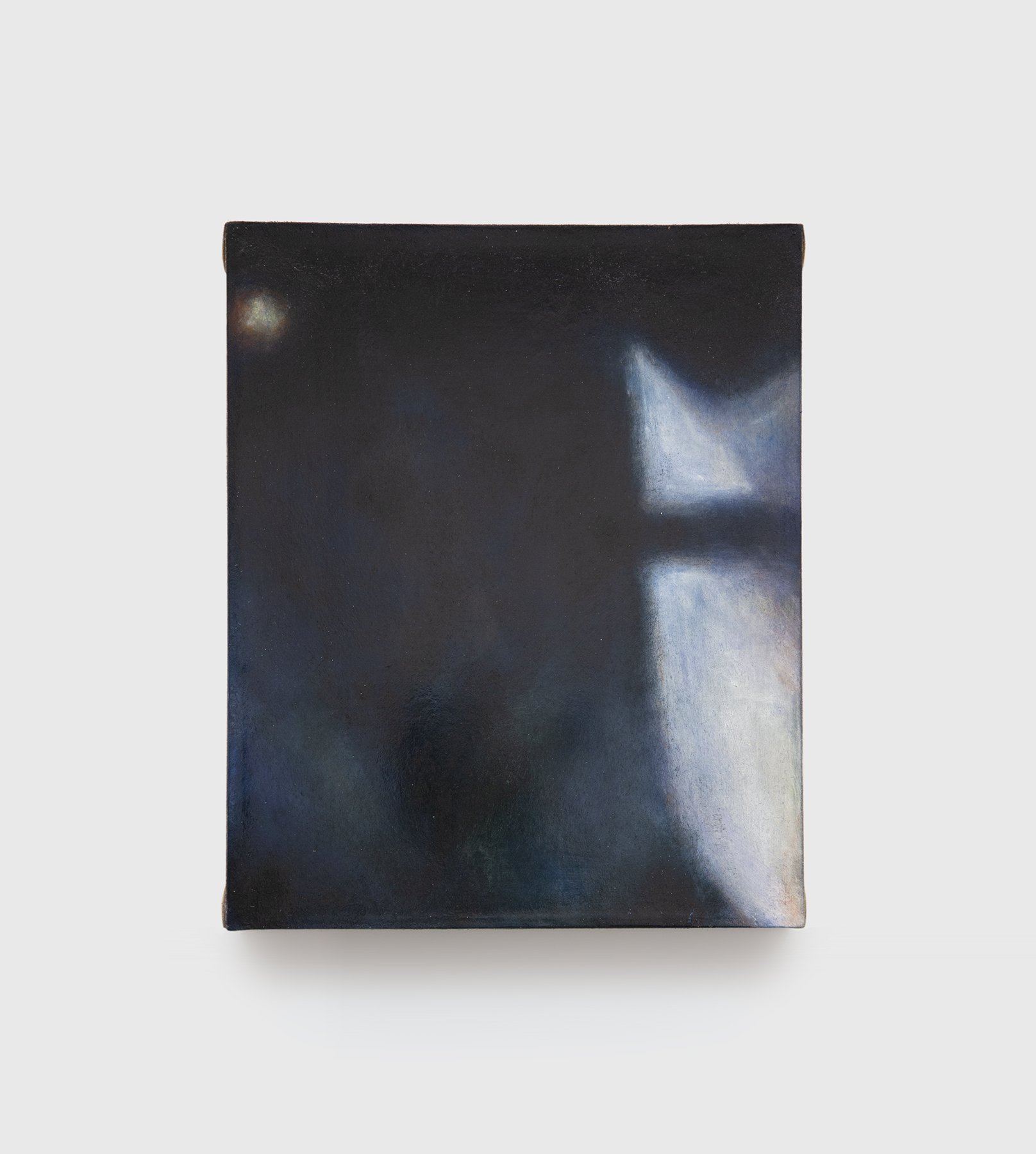
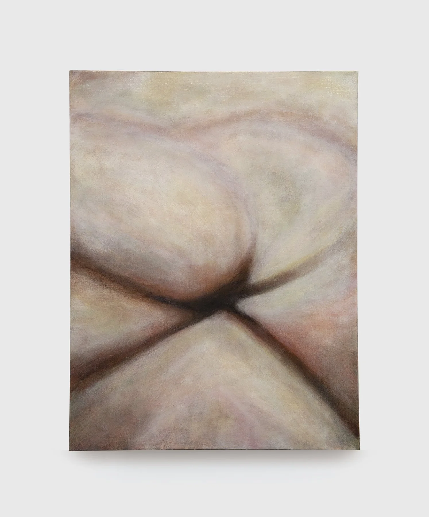

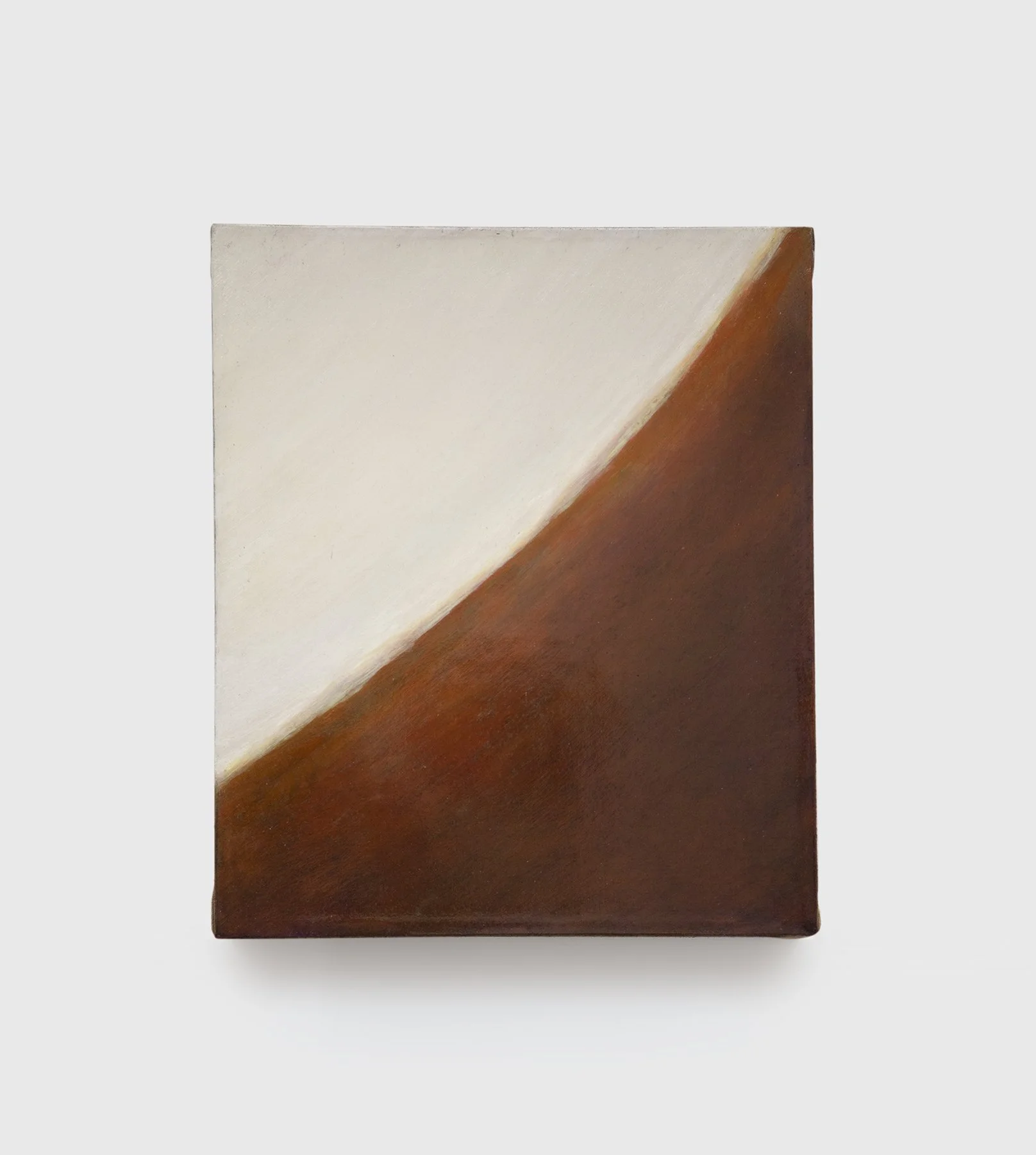
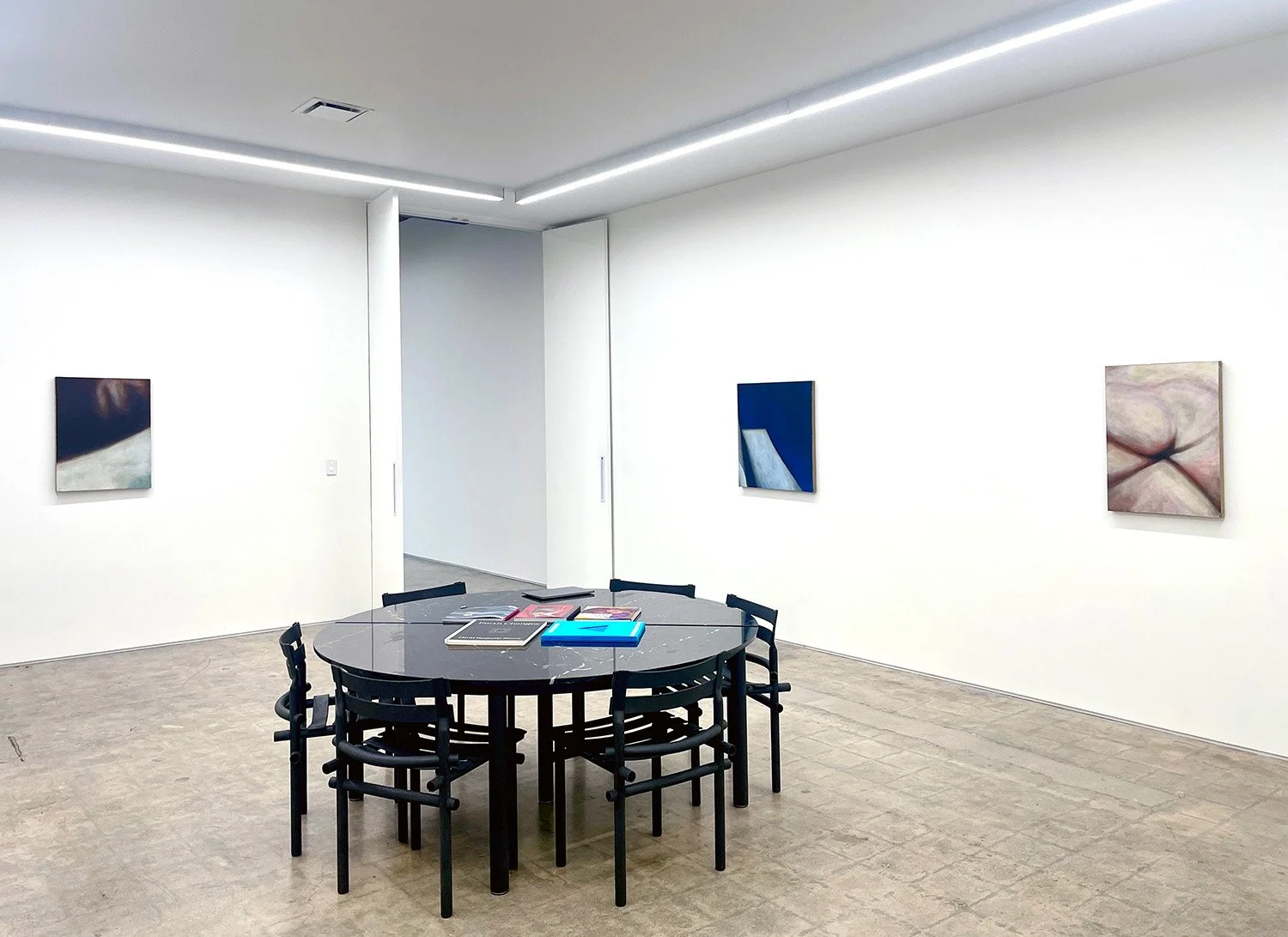
We all we got.
Packer Schopf Gallery
Chicago, Illinois. 2008
Layers of neon pink and green paper painted with bold letters are plastered over the gallery wall like flyers that accumulate on urban buildings or discount signs at grocery stores. These attention-grabbing colors, created from unmixed sign paint, draw the viewer to concise yet open-ended, multilingual thoughts about society. Zora Neale Hurston's observation,"All my skin folk ain't all my kin folk,"and the artist's own mantra, "We all we got," are written in Korean, Urdu, German, French, Spanish, Polish, and Bosnian on these humble posters. In the engravings displayed nearby, the two quotes reappear alongside further social commentary and unknown names tangled within baroque patterning. Where the signs are bright, outgoing, spontaneous, and fragile, the intricate engravings on tar-colored sign substrate are dark, inward, laborious, and relatively permanent. While the signs evoke grassroots advertising, the engravings evoke dangerous and secret forms of expression, such as scratchings on trains and buses, in bathroom stalls, or on desks at the back of a classroom. Executed during his residency at the Museum of Contemporary Art, Chicago (January 15-February 24, 2008), these text-based works draw on familiar modes of communication encountered at stores or on the street in order to capture contemporary voices.
-
We all we got.
Exhibition Essay by Antonia PocockLayers of neon pink and green paper painted with bold letters are plastered over the gallery wall like flyers that accumulate on urban buildings or discount signs at grocery stores. These attention-grabbing colors, created from unmixed sign paint, draw the viewer to concise yet open-ended, multilingual thoughts about society. Zora Neale Hurston's observation,"All my skin folk ain't all my kin folk,"and the artist's own mantra, "We all we got," are written in Korean, Urdu, German, French, Spanish, Polish, and Bosnian on these humble posters. In the engravings displayed nearby, the two quotes reappear alongside further social commentary and unknown names tangled within baroque patterning. Where the signs are bright, outgoing, spontaneous, and fragile, the intricate engravings on tar-colored sign substrate are dark, inward, laborious, and relatively permanent. While the signs evoke grassroots advertising, the engravings evoke dangerous and secret forms of expression, such as scratchings on trains and buses, in bathroom stalls, or on desks at the back of a classroom. Executed during his residency at the Museum of Contemporary Art, Chicago (January 15-February 24, 2008), these text-based works draw on familiar modes of communication encountered at stores or on the street in order to capture contemporary voices.
To better record language that is alive, Genovese created this set of signs and engravings in collaboration with visitors and staff at the MCA. Avoiding static dictionary definitions, he enlisted native speakers at the museum to translate the phrases he ultimately painted on neon posters. Likewise, the intricate engravings produced during this residency were built up from messages carved by museum goers. Because of his insistence on a human element in his work, Genovese's interaction with everyday life as art has a sincerity that is lacking in the innovative contributions of Marcel Duchamp and Pop Art to this terrain. While Duchamp appropriated ordinary objects, Genovese, creates his pieces with his own hands. While Pop artists tended to aestheticize the vernacular, Genovese's work is grounded more in a collaborative process than in an aesthetic. Genovese effectively resurrects Josef Beuys' conception of "social sculpture" whereby social interaction is a work of art and every person is an artist ”without the utopian promise Beuys championed. Though his works often involve painting, then, it is clear that Genovese's medium is not strictly paint, nor is it simply industrial sign materials; he also works with the abstract media of language and human interaction.
-
